Theming — Light, Dark, System, Material You & accents
Echidna's UI is fully theme-aware. You choose a light/dark mode, optionally opt in to Material You dynamic color on Android 12+, or pick one of six curated accent colours. Changes apply immediately, and the choice is remembered in your settings. The in-app Help reader honours the same theme, so the docs match the app.
You can set all of this during the first-run wizard (step 5) or later from Settings.
Theme mode: System / Light / Dark
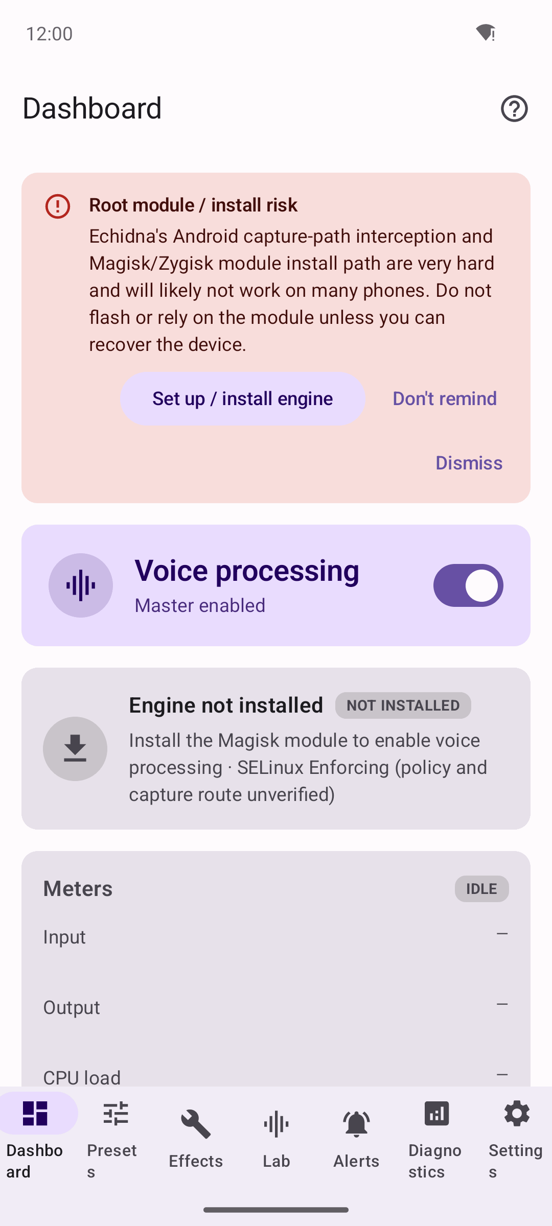
Light theme.
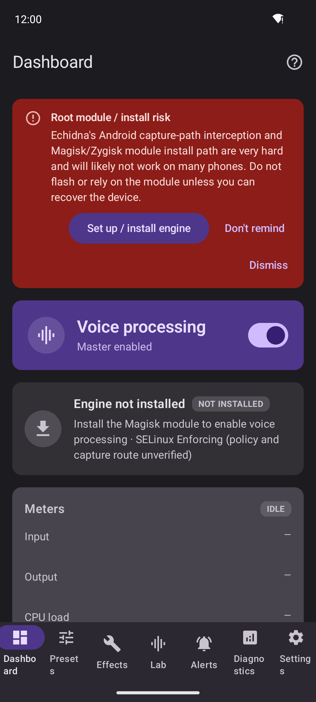
Dark theme. The same screens, the same content — only the palette changes.
| Mode | Behaviour |
|---|---|
| System | Follows the OS light/dark setting (default). |
| Light | Always light. |
| Dark | Always dark. |
System is the default and tracks the device's dark-mode setting live.
Material You (dynamic color)
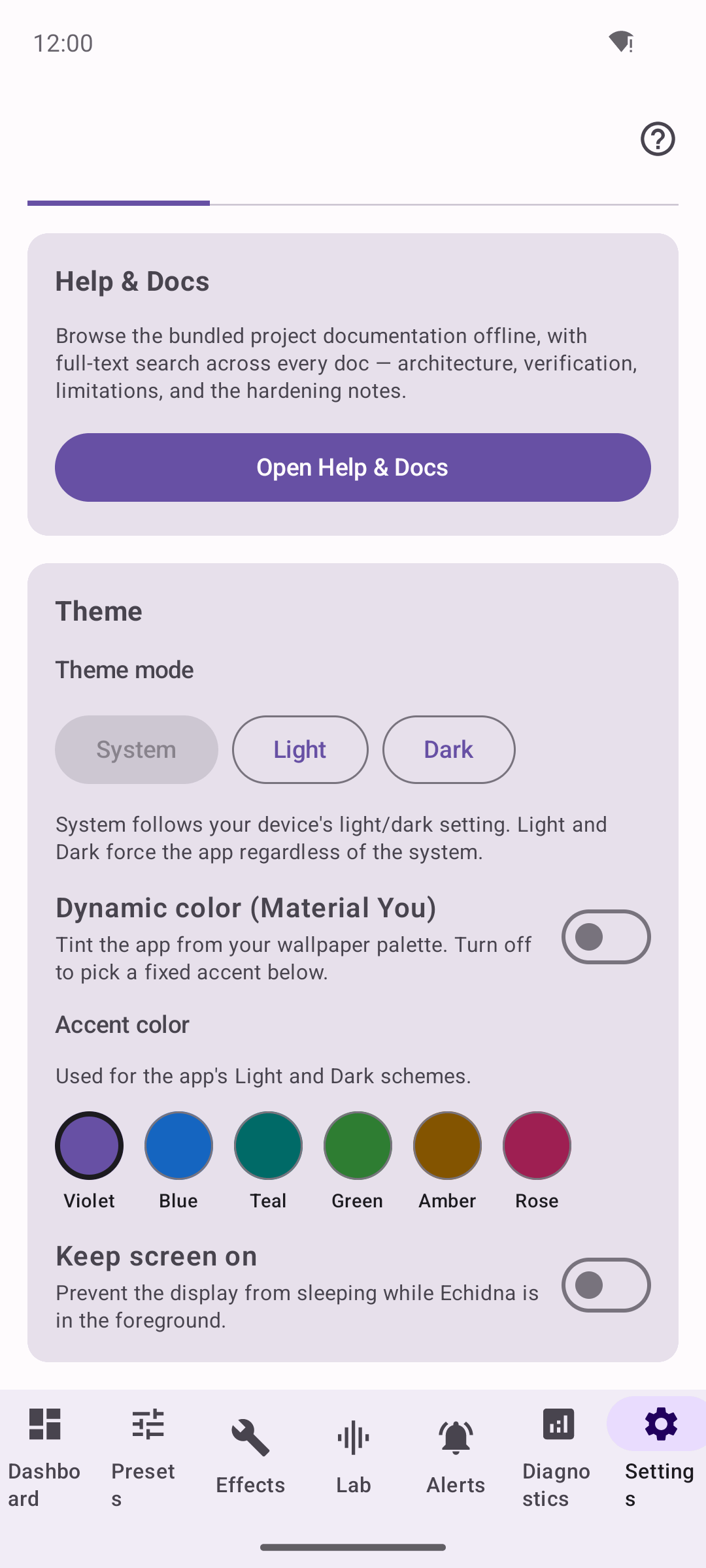
Material You dynamic color derives the palette from the system wallpaper on Android 12+. With it off, you pick one of the curated accents instead.
On Android 12+ (API 31), the Material You colors toggle uses the system dynamic palette derived from your wallpaper for both light and dark schemes.
Availability
Material You dynamic color requires Android 12 or newer. On older versions the toggle is hidden and Echidna uses its curated accent palette instead. When Material You is on, accent selection is disabled — the accent row is labelled "Accent (disabled while Material You is on)", because the wallpaper palette is driving the colours.
Accent colours
When Material You is off (or unavailable), pick from six curated accents. Each maps to a full Material 3 tonal ramp, so it works in both light and dark mode.
| Accent | Notes |
|---|---|
| Violet | Default. |
| Blue | |
| Teal | |
| Green | |
| Amber | |
| Rose |
Accent vs. Material You
Think of it as a switch: Material You = "match my wallpaper" (Android 12+), Accent = "use this specific Echidna colour". Turning Material You off re-enables the accent swatches.
Where the setting lives
Theme mode, the Material You toggle, and the accent are stored in your app settings and applied instantly across the whole UI — including the in-app Help reader, which renders these docs with your chosen theme and accent.
Related
- Getting Started — set your theme in step 5 of the wizard.
- Widgets & Quick Settings — home-screen surfaces that follow the app state.